


Shoutbox Trigger Customization
Customizing Trigger Color, Sizing, and Label
By default, the Reamaze.js Shoutbox will load with a default appearance, which act as the trigger for the shoutbox. You can customize the color, size, label and even screen position by copying the following snippet into your HTML and altering the values.
Copy and place the following code anywhere in your HTML. You'll need to replace the parameter values with values that match your customization, following the description below.
<script type="text/javascript">
  _support['ui']['widget'] = {
    position: {
      right: "{{ PIXELS_RIGHT }}",
      bottom: "{{ PIXELS_BOTTOM }}"
    },
    label: {
      text: "{{ LABEL_TEXT }}",
      delay: {{ LABEL_DELAY}},
      duration: {{ LABEL_DURATION }},
      mode: "{{ LABEL_MODE }}",
      sound: "{{ LABEL_SOUND }}"
    },
    size: {{ ICON_SIZE }},
    icon: "{{ ICON_PREFERENCE}}",
    color: '{{ THEME_COLOR }}'
  };
</script>
Parameter Values
- The
positionvariable can be any CSS-like position value. You can use this to position the trigger widget in any corner of your UI (e.g. by usingleftortopinstead ofrightorbottom, respectively). {{ PIXELS_RIGHT }}has a default value of22pxand can be changed to any CSS valid pixel value.{{ PIXELS_BOTTOM }}has a default value of22pxand can be changed to any CSS valid pixel value.{{ LABEL_DELAY }}is the delay in seconds before the label is displayed and has a default value of3.{{ LABEL_DURATION }}is the duration in seconds before the label is hidden and has a default value of30.{{ LABEL_MODE }}isdefaultby default but can be changed tonotification. See "Notification Style Prompt" section below for more details.{{ LABEL_SOUND }}isfalseby default but can be changed totrueifmodeisnotification.{{ ICON_SIZE }}has a default value of52and can be changed to any integer value.{{ ICON_PREFERENCE }}has a default value ofdefault(Reamaze logo) and can be changed to eitherhelp(Question Mark) orchat(Chat Bubbles).{{ THEME_COLOR }}has a default value ofrgba(16, 161, 197, 1)and can be changed to any CSS valid color value. This affects both the trigger as well as the color theme of the shoutbox.
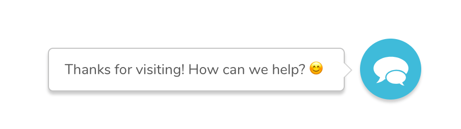
Example
The following example makes the shoutbox trigger display as shown in the image above.
<script type="text/javascript">
  _support['ui']['widget'] = {
    position: {
      right: "22px",
      bottom: "22px"
    },
    label: {
      text: "Thanks for visiting! How can we help? 😊"
    },
    size: 56,
    icon: "chat",
    color: '#33b7d8'
  };
</script>
Notification Style Prompt
You also have the option of changing the label attribute to display a more noticeable Notification style prompt.
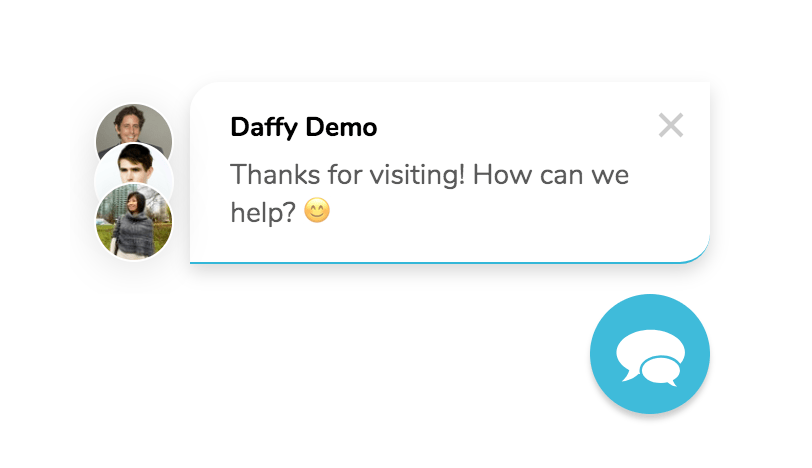
To enable this style, simply change the mode attribute of the label to "notification". You can then optionally set sound to true or false (default).
Example
The following example makes the shoutbox trigger display as shown in the image above with a Notification style prompt.
<script type="text/javascript">
  _support['ui']['widget'] = {
    label: {
      text: 'Thanks for visiting! How can we help? 😊',
      delay: 3,
      mode: 'notification',
      sound: true,
    },
    color: '#e57d58'
  };
</script>
Next Step
If you'd like to remove the shoutbox trigger completely and invoke the support UI directly, you can do so by reading through the next section.
Join thousands of teams using Reamaze to impress customers.
Find out how with a free account.
 Sign up with Google
 Sign up with Microsoft